Flutter: Dark mode with Provider
Almost every smartphone app nowadays, such as Instagram, Whatsapp, and Youtube, uses a dark theme. It’s simple to do in Flutter; all it takes is a few lines of code. But first, let’s go through the key flutter concepts that go into creating the dark theme.
ThemeData Class :
The App’s theme is defined by the ThemeData class. It’s a feature of MaterialApp that allows you to customize the app’s design. We can adjust it and override it according to our needs.
Let’s have a look at the code and see what’s new in the ThemeData class.
The following are the most important parameters of the ThemeData class:
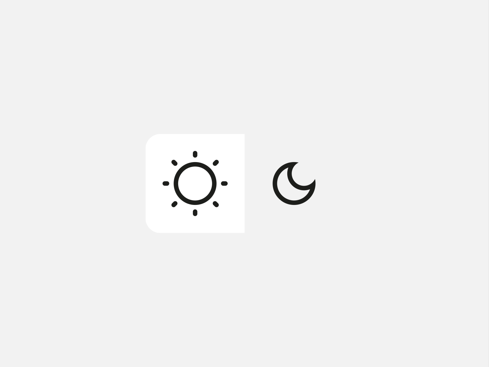
- Brightness :
Describes a theme’s or color palette’s contrast.
- visualDensity :
The vertical and horizontal “compactness” of the components in the UI is referred to as visual density. Note that the horizontal and vertical densities must be less than or equal to the maximum horizontal or vertical density, i.e. 4.0.
- primaryColor :
Defines the primary color for the app; similarly, the primary color for a light and dark theme can be defined.
We can also define accentColor, accentColorLight, and accentColorDark, which you are free to utilize in your app.
- IconTheme:
Color, opacity, and size of icons are all controlled by this property.
In the flutter official documents, you can also have other characteristics. Personally, I recommend going to the official Flutter docs at least once.
Let’s get started now that we have adequate information to achieve our aim. We’ll utilize the Provider package; it’s not required; we can do the dark theme implementation without it, but we’ll use it for better architecture. In the pubspec.yaml file, add the provider package.
main.dart
This is our primary class, and it is from here that the execution begins.
MyApp.dart
Take a look at the MaterialApp(theme )’s properties; everything we’ve spoken about so far is written here. I hope this clarifies things for you.
We’re giving an instance of SharedPreferences to our DarkThemeNotifier-ChangeNotifier class asynchronously, which allows us to identify the basic app settings that will be applied whenever the app is opened.
MyHomePage.dart
This class contains the app’s user interface; when we tap on the settings icon, the onPressed: () defined in our business class is called. To get a dark and light theme, we only toggle one boolean variable.
DarkThemeNotifier.dart
This is the business class, and it’s where we do all of the business logic and operations. Although the functionality of this class is limited in our example, it is the correct strategy for separating our UI and business logic and adhering to good architecture when developing an app.
We extend the ChangeNotifier class from the provider package in this class. Just have a look at the onPressed: () method; we’re using notifyListners () there. When we call this function, we simply instruct the listeners to rebuild it in order to obtain an updated or new value. We simply toggle the boolean value in our situation.
Thank you for taking the time to read this article. If you found this post to be useful and interesting, please clap and recommend it.
if I got something wrong, mention it in the comments. I would love to improve.
